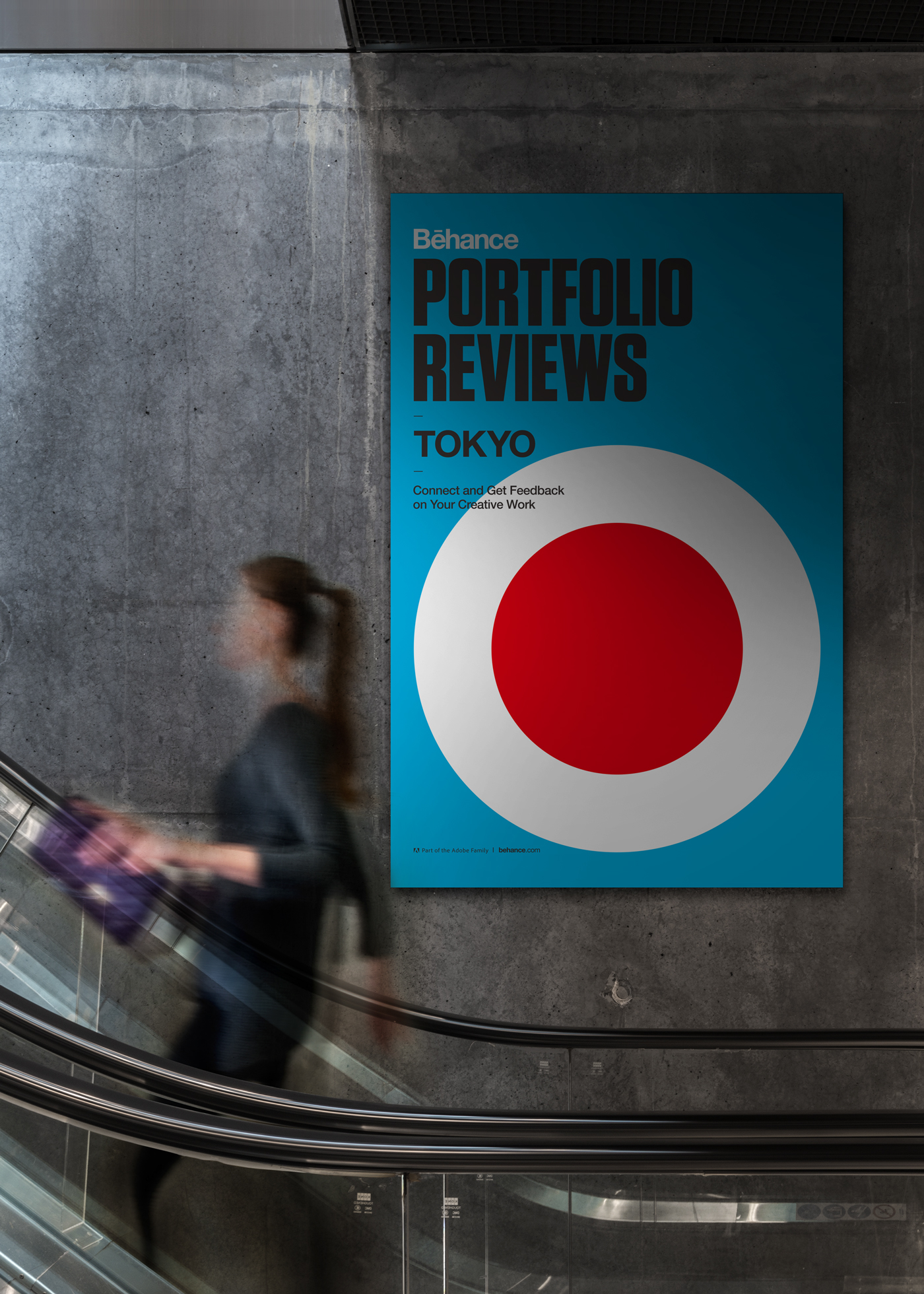
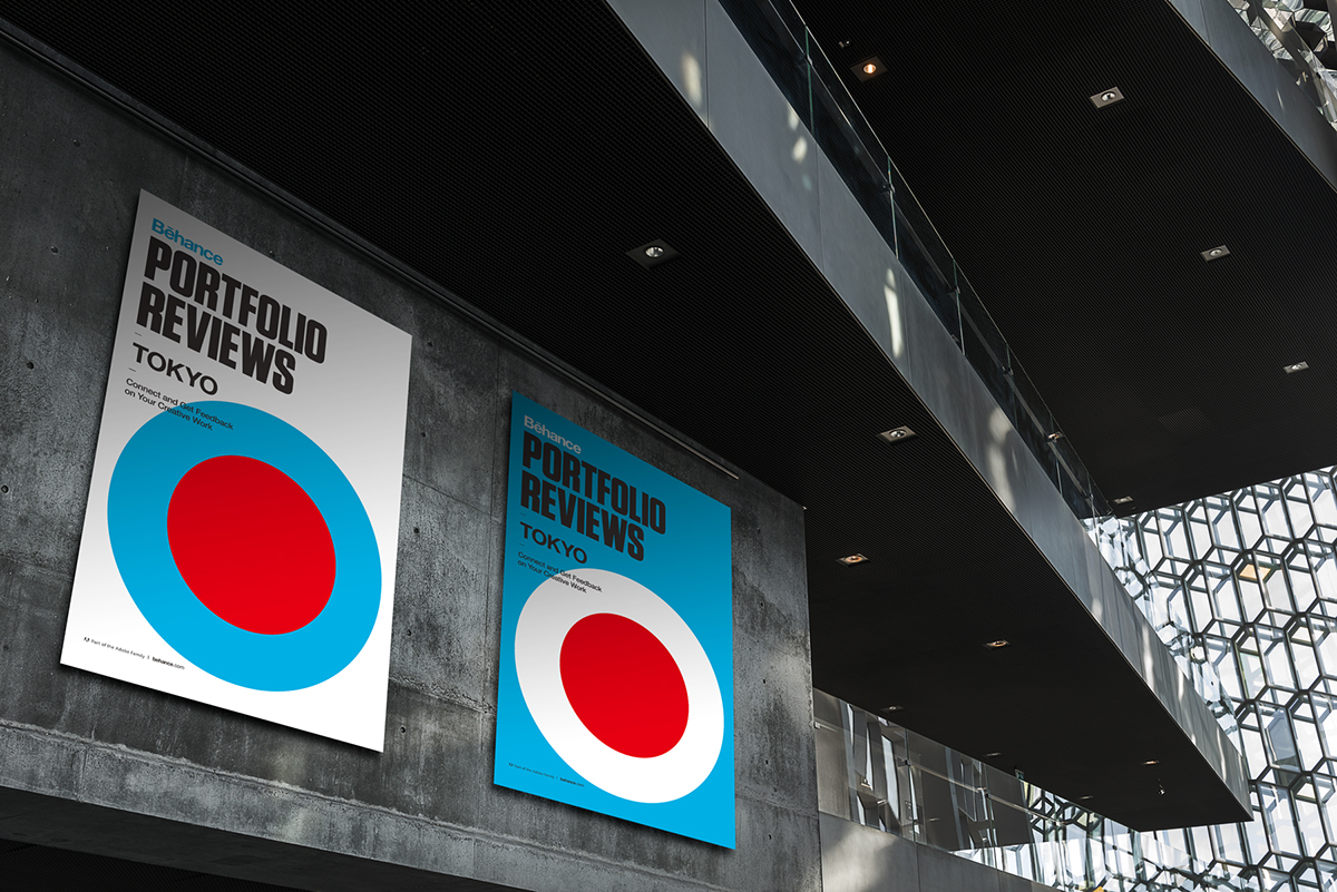
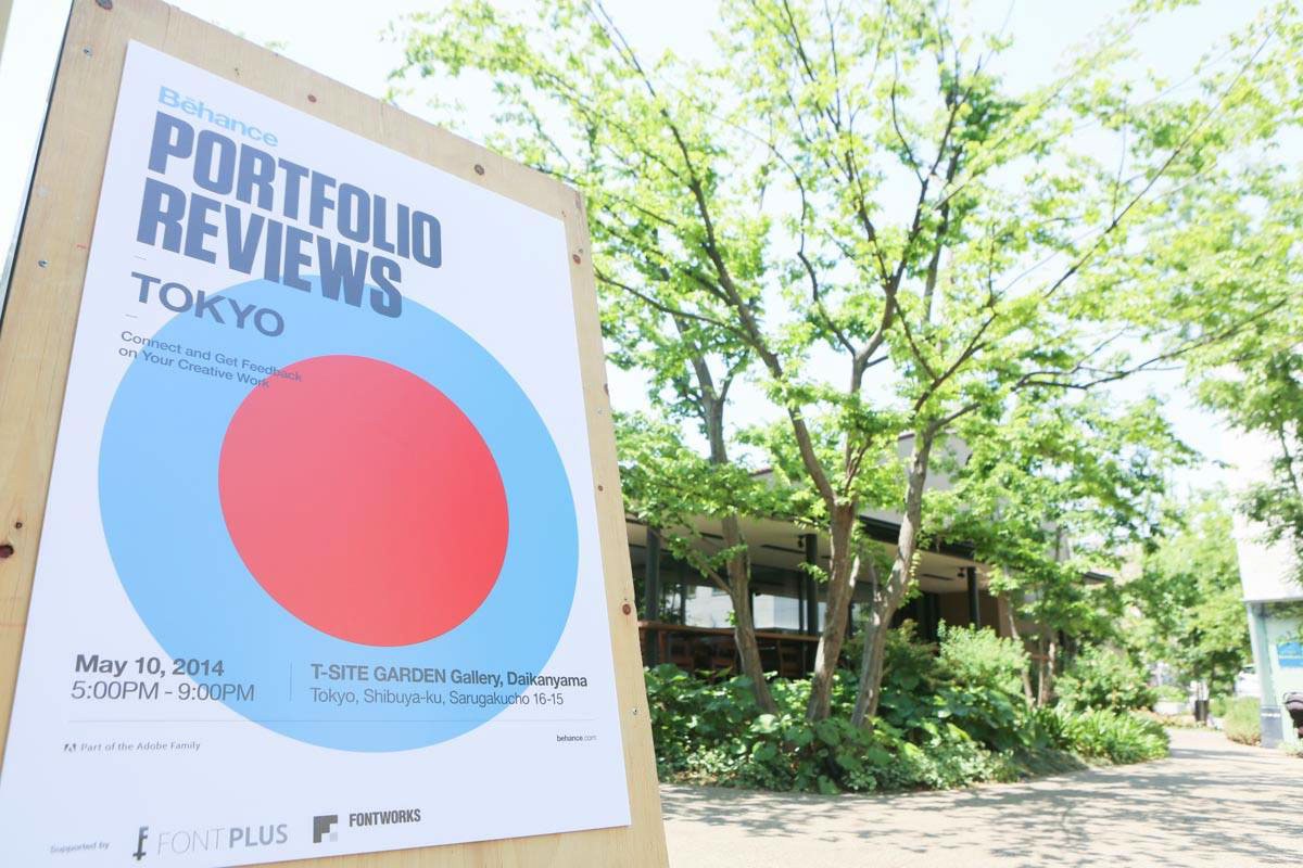
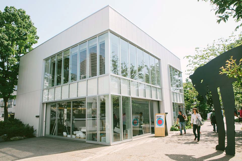
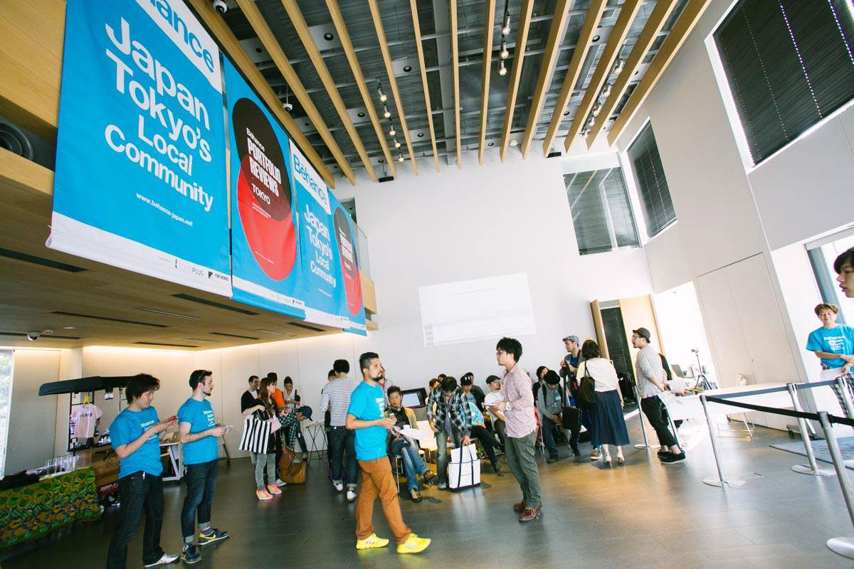
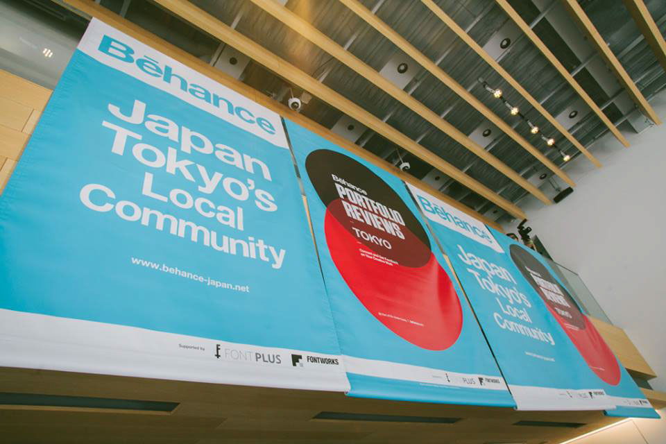
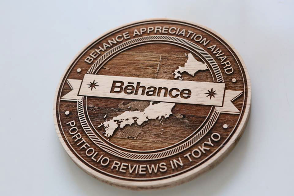
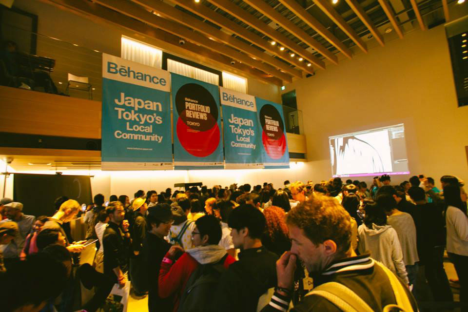
These posters were created for the Behance Japan Community Portfolio Reviews #5 (hold in 2014/05/10 at T-Garden Daikanyama).
The mission of the Behance Japan Community is to create events and stimulate creators to share and connect leading to various opportunities, to encourage creators to take advantage of the Behance platform and to promote creators overseas outside of Japan.
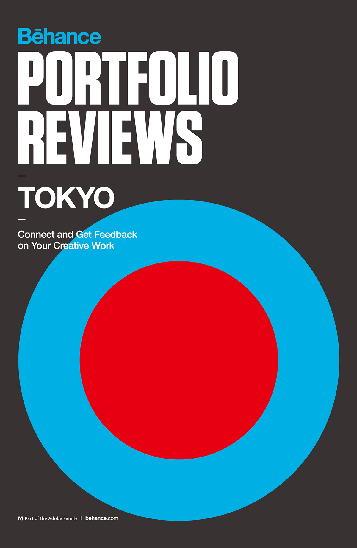
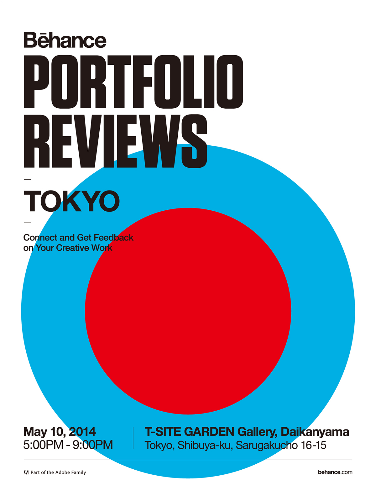
In order to provide a strong visual effect, these were kept in mind configuration as simple as possible.
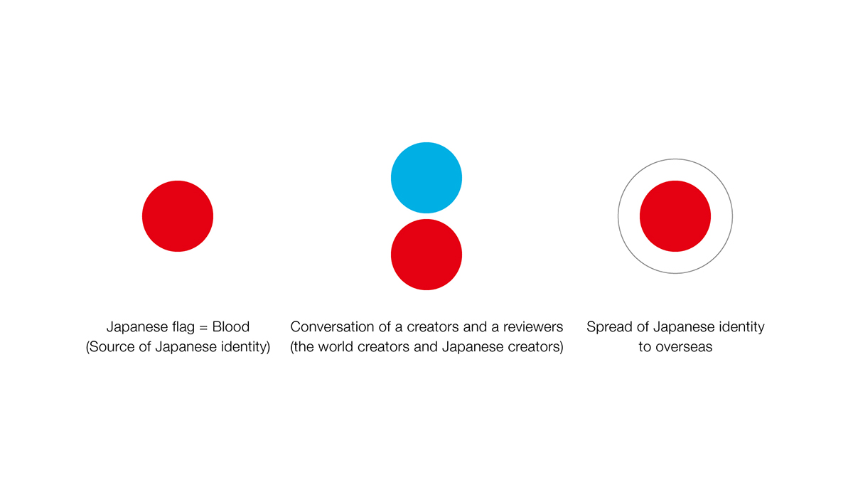
Red circle is a flag that symbolizes Japan. And, it express Japanese blood. (source of Japanese identity)
A.
Two perfect circle express a creator and a reviewer participating in Portfolio Reviews.
And also, it expresses the conversation of the world creator and Japanese creator in Behance.
B.
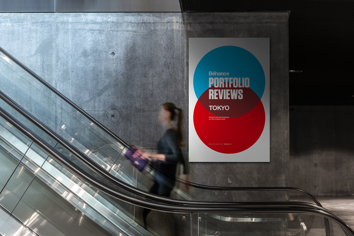
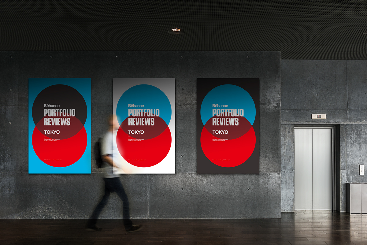
Two perfect circle are symbolizes the spread of Japanese identity.
Two perfect circle are symbolizes the spread of Japanese identity.
Of course, cyan color represents the creators of overseas (Behance).


A_printl poster grid


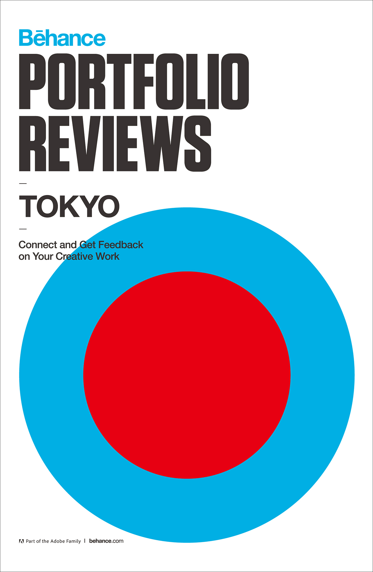
A_print poster
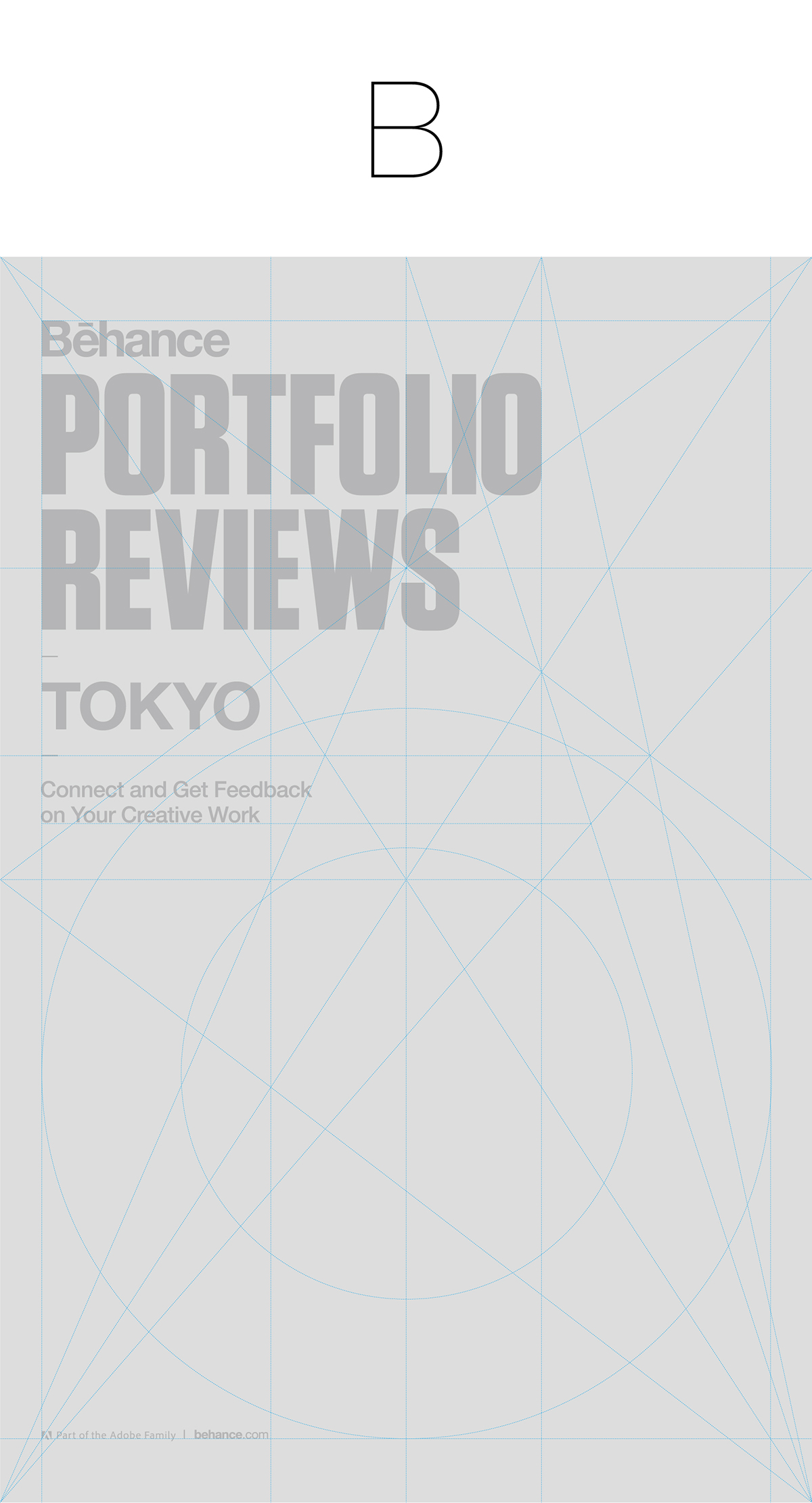
A_printl poster grid

B_print poster

A_digital poster grid


A_digital poster

B_digital poster grid


B_digital poster
A_mock up
A_mock up
B_ mock up

B_mock up


Client: Behance Japan Community Team - Behance portforio Reviews
Range of work: Degital & print poster
2014 TOKYO, Japan
2014 TOKYO, Japan
Photographer: Taio Konishi (Behance Japan Community)
Planner & Founder: Maykol Medina (Behance Japan Community)
Manager: Hideji Terada (Behance Japan Community)
Behance Japan CommunityTeam:
Fun Fun Kubo, Ellies Pieters, Tomoya Nakamura, Taio Konishi, Nao Sato
Manager: Hideji Terada (Behance Japan Community)
Behance Japan CommunityTeam:
Fun Fun Kubo, Ellies Pieters, Tomoya Nakamura, Taio Konishi, Nao Sato
http://behance-japan.net/portfolio-review-5/
https://www.facebook.com/BehanceJapan
https://twitter.com/BehanceJp
https://www.facebook.com/BehanceJapan
https://twitter.com/BehanceJp
Web reference: